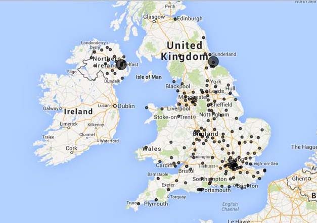
There is the danger of PR overcomplicating the issue of evaluation, so we quite liked this simple map based solution from Spectrum Insight.
The new system reduces graphs to a minimum and in many cases removes them all together, replacing them with geographical maps on which the strength and sentiment of media coverage is visualised.
The new system, called ReachMaps, enables users to see in an instant where media coverage has appeared, the messages it has delivered, its tonal sentiment and the topics and issues it raises. As well as being able to zoom in and out at any point to explore the analysis of coverage at different levels of detail, users can also click through to the media coverage directly from the maps.

Caption: The image shows NHS Tone and message for community services from May 01 to June 16th
Commenting on the new system, Mark Westaby says: “ReachMaps address criticism the PR industry has justifiably aimed at media evaluation companies for failing to deliver simple and highly effective measurement systems. ReachMaps deliver intuitively powerful insight, often without a graph in sight, which makes them both simple to use and easy to understand. They can be updated in real-time and shared across an organisation using nothing more complicated than an email.”
PRmoment Leaders
PRmoment Leaders is our new subscription-based learning programme and community, built by PRmoment specifically for the next generation of PR and communications leaders to learn, network, and lead.
PRmoment LeadersIf you enjoyed this article, sign up for free to our twice weekly editorial alert.
We have six email alerts in total - covering ESG, internal comms, PR jobs and events. Enter your email address below to find out more:


